Tuesday 20 November 2012

Sometimes You Need to Reflect.....

Have you got a lot of mirrors just unhanging around waiting for a place to call home?

Well here a few possibilities....


Mirrors bring light into the room with their reflective properties. So, if you have a dark room or narrow hallway for example, bring in a mirror. The mirror can, in a way, be like a window bringing light into a space.  

Bing Images 


Using mirrors as artwork can really make a a room stand out. The room below has used old windows casings to frame the mirrors. You can see how such a simple idea can become the centrepiece of the room. Throw in the colours of the round carpet and the flower arrangement and voila!

Elle Decor


If you have several mirrors try combining them! Add in a few pictures and see what you can create. In the picture on the left they have even used empty picture frames to tone down the look. Whatever you decide to do, remember to consider the balance of your display.


Mirrors can give a room depth.
 As you can see in these pictures, the mirrors reflect other parts of the room opening them up to display architectural detail and make the space feel more open and interesting.       .

                                              
HGTV


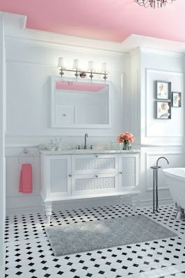
When using mirrors in traditional places, 
such as bathrooms and bedrooms, try a different shape or frame. 


Olindes.com
          
Mirrors are not just for walls. 
They can be used in furniture, and, well, even ironing boards!       


Houzz


Mirrors aren't just for indoors, how about in the yard?


Roadkillrescue.net

These are only a few ideas, I'm sure there are lots more...If you have a good one, send me a picture, I would love to see it!


To see more of Wall Works, check out our Facebook and web pages....

www.wallworks.ca  https://www.facebook.com/WallWorksOttawa


Friday 7 September 2012

Pattern, Pattern and More Pattern!


I love putting patterns and colours together, and creating an interesting and fun environment. It's all about layering, the more layers you add, the more interesting it becomes. Here's the trick...don't overdo it!
Here are a few tips to help you wade through the tricky waters of pattern:


Use one pattern as the focal point, and the other pattern as the partner. In this room the wallpaper is the focal point, with the rug being secondary with its bold colours. The solid colours help to soften the look, while the pink throw and orange tissue holder add little bursts of colour to give an extra punch.


Using the same colour family while changing the hues and colour values can make a statement. Add some texture to the fray to mix it up.


This kitchen is a great example of how texture, while in the same colours, can really be a show stopper.


Using understated patterns, small stripes or dots, for example, mixed with large florals, can give you a wonderful and fun look! The Pottery Barn bedding on the left is a great example of this. If you are feeling a little more bold, check out the bedding on the right. Using the same colours, but in different patterns, is another great trick. Throw in some solids to break up the visual space and you'll have a winner every time!


Different intensities of patterns can work together too. A dense pattern mixed with a sparse pattern, even changing up the size of the prints, can be stunning.

If you're worried about too much, use some neutral tones. Now this sofa is definitely not everyone's taste, but it is a great example of how the neutral tone of the wall softens the whole look of the room.


So bottom line, have fun! Start with a base and work from there, adding a bit at a time. Don't be afraid to play around!
If you have any questions, don't be afraid to contact me at WallWorksottawa@gmail.com or Facebook.com/wallworksottawa.

Monday 13 August 2012

Look up...look way up...it's not a bird...it's not a plane. It's your ceiling!


    Ceilings are often the most forgotten space in your home. Automatically we go for the plain white. But think again. Using your ceiling as a design element can be very cool.

    South Beach Style, Canadian House & Home, Ted Yardwood Photo

    The soft blue colour on the ceiling creates a fresh and open feel. It would be hard to sit in this room without feeling your sunny disposition coming out. The crown moulding separates the two colours and defines the top of the wall. The light blue actually pulls your eye up, and using the proper accent colours throughout the room has created a sense of balance and unity.This room would be just another room if they had chosen white for the ceiling.


    Dark vs. Light 


    The general rule of thumb is that lighter coloured ceilings feel higher, and darker ceilings feel lower. Just to confuse matters, however, dark coloured walls with a white ceiling, create a huge contrast, and the space will feel smaller. This is because the ceiling becomes the focal point.

    Benjamin Moore

    In this room the dark coffered ceiling adds dramatic flair and creates a stunning overall look. The ceiling is now a design element creating an intimate and cozy environment. The dark brown of the dining room table adds balance and gives extra weight to the floor, while the soft green in the niche softens and adds interest. 

    In contrast, you can see how the dark walls of this room make it feel smaller, with your eyes going right to the ceiling. It is a striking look, and  the use of the white carpet and furniture bring your eyes back down and create a balance that works.  

     Benjamin Moore

    What about Sheen?

    A few things to remember when considering a dark ceiling is the height and sheen. Using a dark colour in a room with a ceiling lower that nine feet can create a claustrophobic feeling. One way to get around this is to use a paint with a higher sheen . Normally we use a flat paint on the ceiling, but a higher sheen will add some reflective qualities, making it feel higher. The problem with this is that the shine will show every little defect, so your ceiling has to be in absolutely  perfect condition.

    Walls and ceilings the same colour?

    Yes, definitely! When you use the same colour on the ceiling and walls, you can camouflage many things. The monochromatic colour creates a continuous surface, so, if you have a room with many angles, painting everything the same colour can help hide all those lines. 


    In the room below the first thing you notice are all of the wall and ceiling lines. I like the colours, but I find all the angles confusing.


    Another place to paint all the same colour is in a powder room or any other small space. Because there is no transition in colour, the room feels calmer and more restful.

    Wall Works

    In this powder room we kept the ceiling the same colour as the wall and even enhanced it with a hand painted border making it more interesting. Powder rooms can be great places to have fun!

    What Colour Should I Use?

    If you are painting your wall a darker colour and don't want the stark contrast of white, you can tint your ceiling paint from 50% to 20% of the wall colour. This will still give you the interest but keep the feel more unified. 
    Benjamin Moore

    And as I've said before,  Nature's colours are always a safe bet.
    Some favourites  are:

    Sky blue
    Butter yellow
    Warm tans
    Soft pink


    Nicole Staker Design

    Ceilings With Design

    A design on the ceiling can add a whole other dimension to the room. In this dining room we designed a huge stencil and applied it to a parchment background.

    Wall Works

    This room is using wall paper on the ceiling. If you decide to try this, make sure the walls are not wallpapered. You don't want a wallpaper nightmare! 

    Apartment Therapy

     Try it Out!

    If you do decide to paint your ceiling, spend a bit of time to think it through. You could even get a sample of paint and try a patch to see how it feels.


    You may not want to try the Michelangelo style ceiling, but think ceiling next time you are choosing colours for your room!


Monday 23 July 2012


Nature Always Gets It Right!

     I have always been a nature lover, and regularly take photos of what Mother Nature has to offer.  She never seems to screw it up! When I choose colour combinations for my clients, I always keep in mind what I see in the natural world around me. 


Silkweed Milkweed      Wall Works

     When I took this picture of a common Ontario weed, (Milkweed), it was because I noticed the colours. The beautiful soft pinks and gentle greens could easily be used in a girl’s bedroom or bathroom.


Purple Cone Flower     Wall Works

     As I was focusing my camera on this Echinacia flower, a bee happened by, and voila! A perfect blend of colours. These colours could be used anywhere in your home.  Although the orange and pink are very popular now, they should be used with care, as they can easily be overwhelming. Adding in yellow softens the look and could have a more calming affect. When you have strong colours, they can easily be used as accent colours. As this room below shows.


     As the Bee continued meandering throughout my garden it landed on this Globe Thistle. Wow, I love all these colours, they would look wonderful in any room of your home. Very calming and relaxing, and would be particularly effective in a bedroom. 

Globe Thistle      Wall Works

     For something a little more dramatic, try these colours. I actually used a version of these colours in my own kitchen. The walls are a soft green and I accented with the red, including this Anthurium.


Red Anthurium   Wall Works


     So the next time you look at a garden or landscape, let the natural world around you be your inspiration, and use Mother Nature as your guide!

Susan
Wall Works
613 277-1367

Wednesday 20 June 2012

The first one! 
I have to say that I am a bit nervous, this being my first blog. Since this is for Wall Works, there will be no bearing of soul or anything like that. Just my random thoughts on decorating and colour.  But I hope to still make it worth the read….you can let me know!

Something to think about:
Check out this picture.
 To me, it illustrates the flow you can feel as you walk from room to room in a home.  It is wonderfully
 simple but makes a great statement.  The colour of yellow on the door has been washed with a green glaze to soften it. Be careful with yellows, they can be very scary if not chosen with great care.
The large black and white design of the wallpaper brings a more formal atmosphere to the space, while softening the lines.
So, while you are choosing the colour pallet for your home, remember to consider  the colour flow through your  spaces, and not just in your spaces.

Tidbit for Today
 The pupil  of your eye expands as much as 45 percent when a person sees something pleasing.  Now you can look at your kids and know it they are pleased to see you…..or not!

See you next time
Susan